- HEX
- #5F003F
Primary colour
- RGB
- 95 / 0 / 63
- CMYK
- 0% / 100% / 34% / 63%
 Start a project
Reinterpreting a legacy. Reimagining wine in a can.
Concept rebranding
Art Direction


01 / RESEARCH
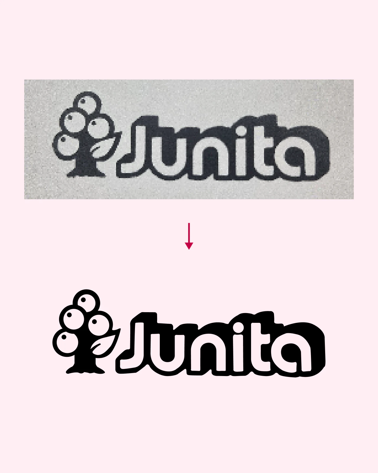
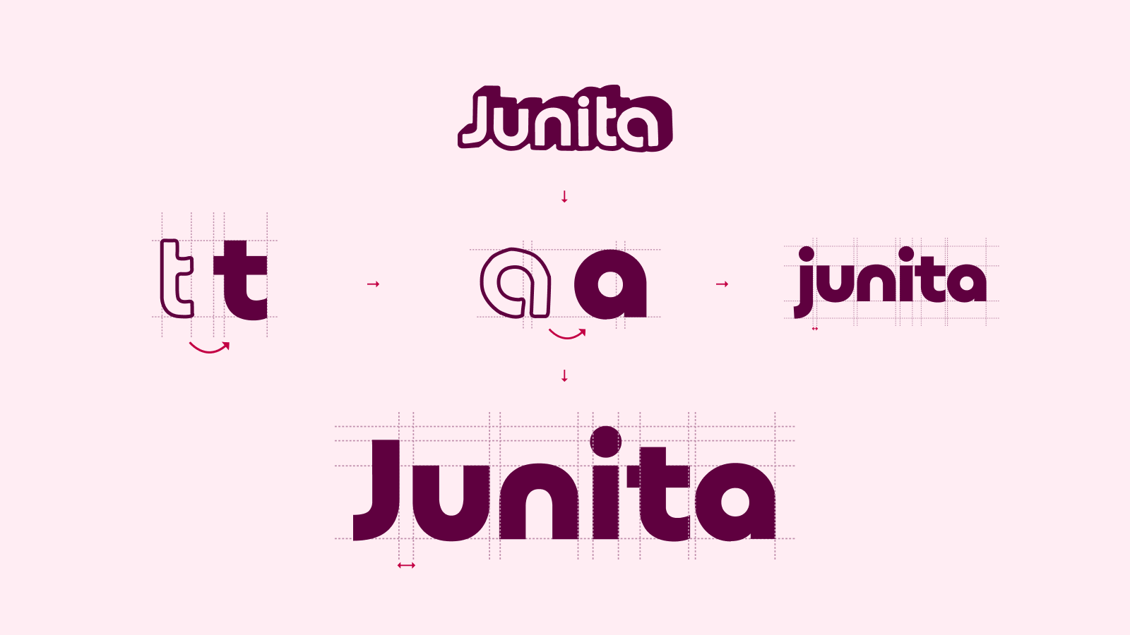
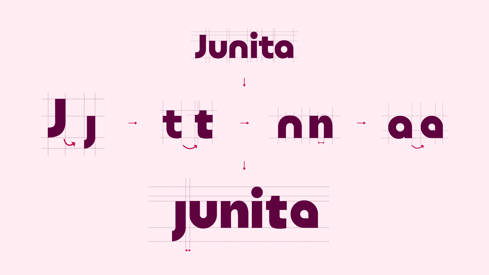
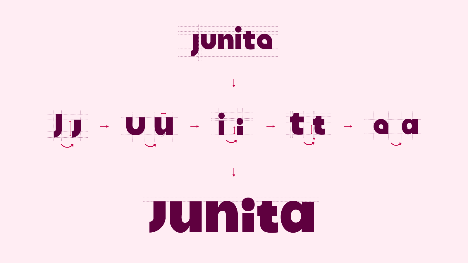
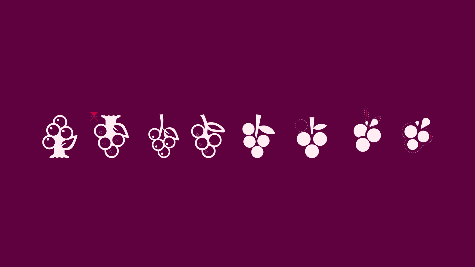
Junita is a concept rebranding project based on a name and an old vine logo that my team and I selected from a 1960s collection. The challenge was to reinterpret that legacy for an imagined canned wine brand based in Tarragona, Spain. I developed an identity and packaging that approached wine as something accessible, sociable and easy to take along. I began by vectorising the original logo, then explored simpler letterforms, lowercase lettering and revised proportions. In parallel, the vine gradually became a more geometric grape symbol.
02 / REBRANDING
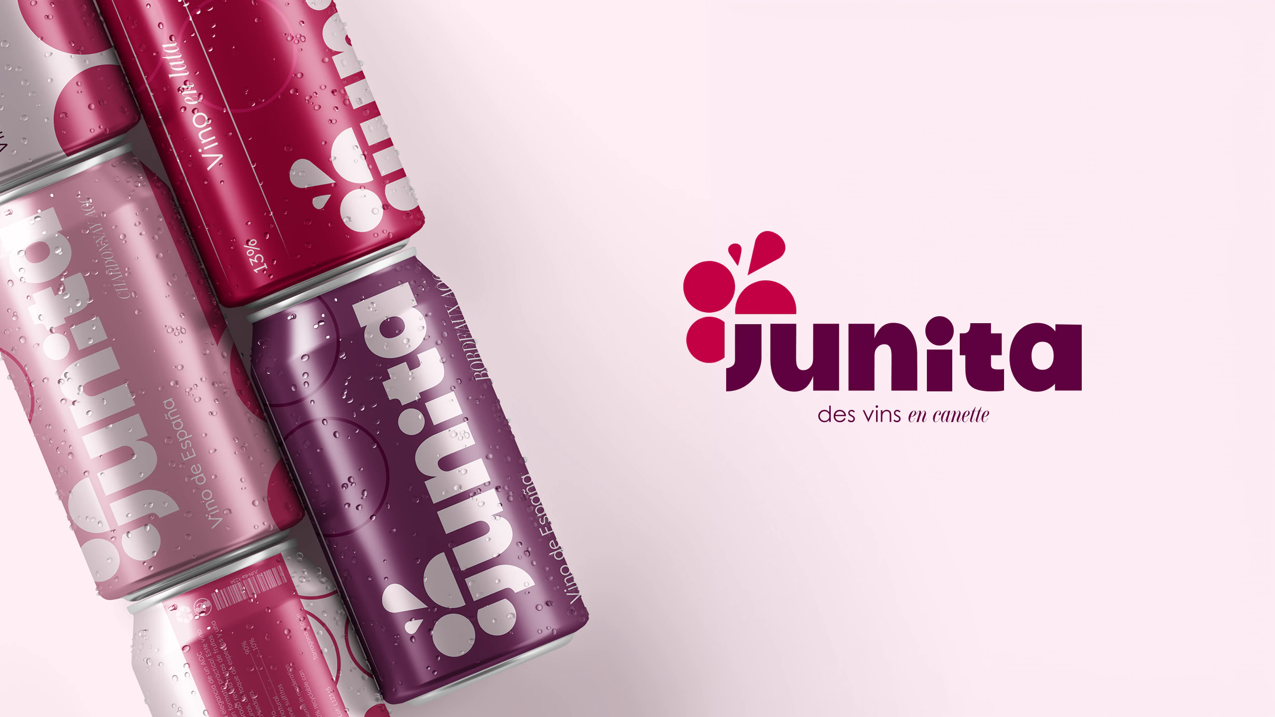
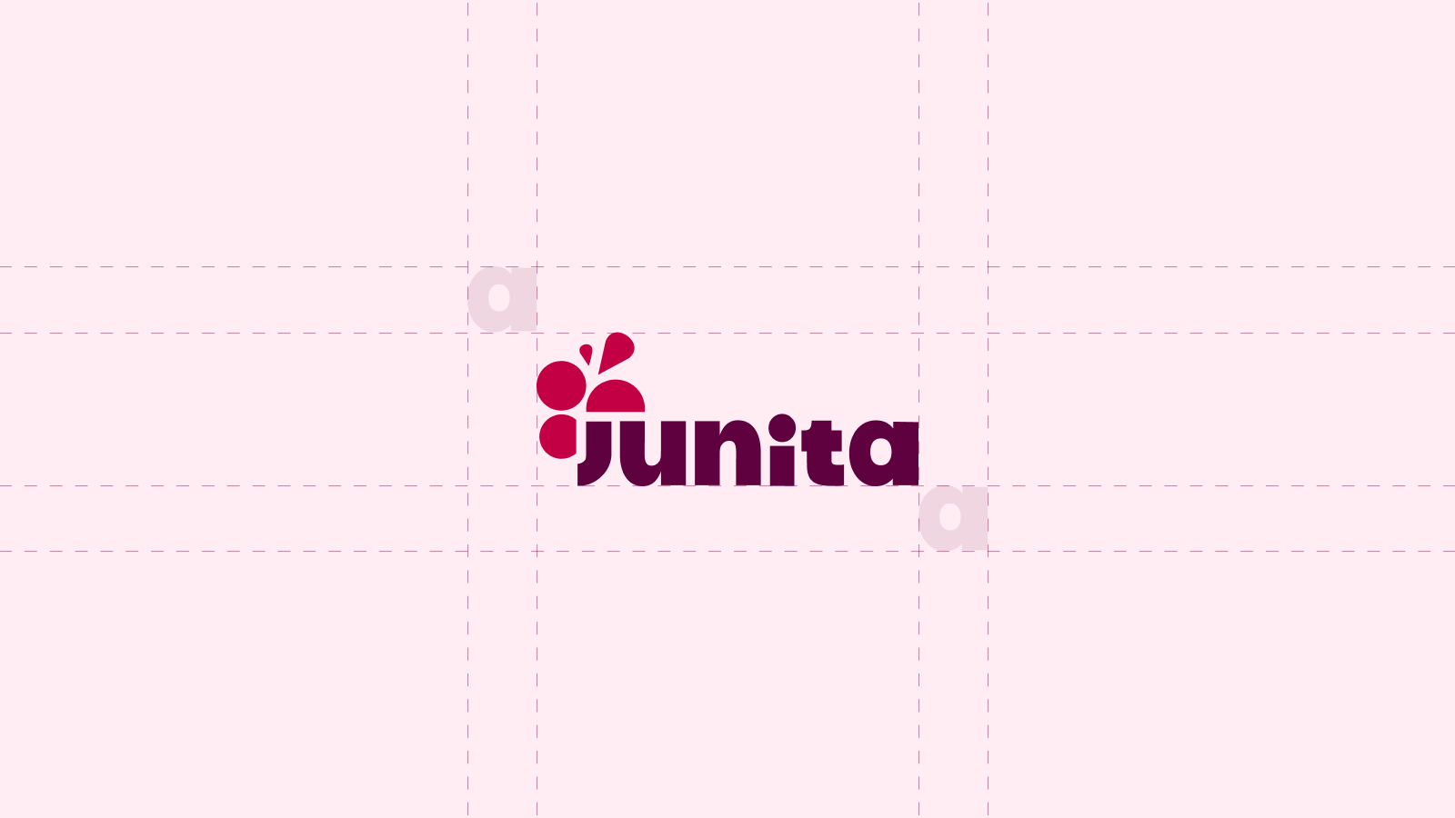
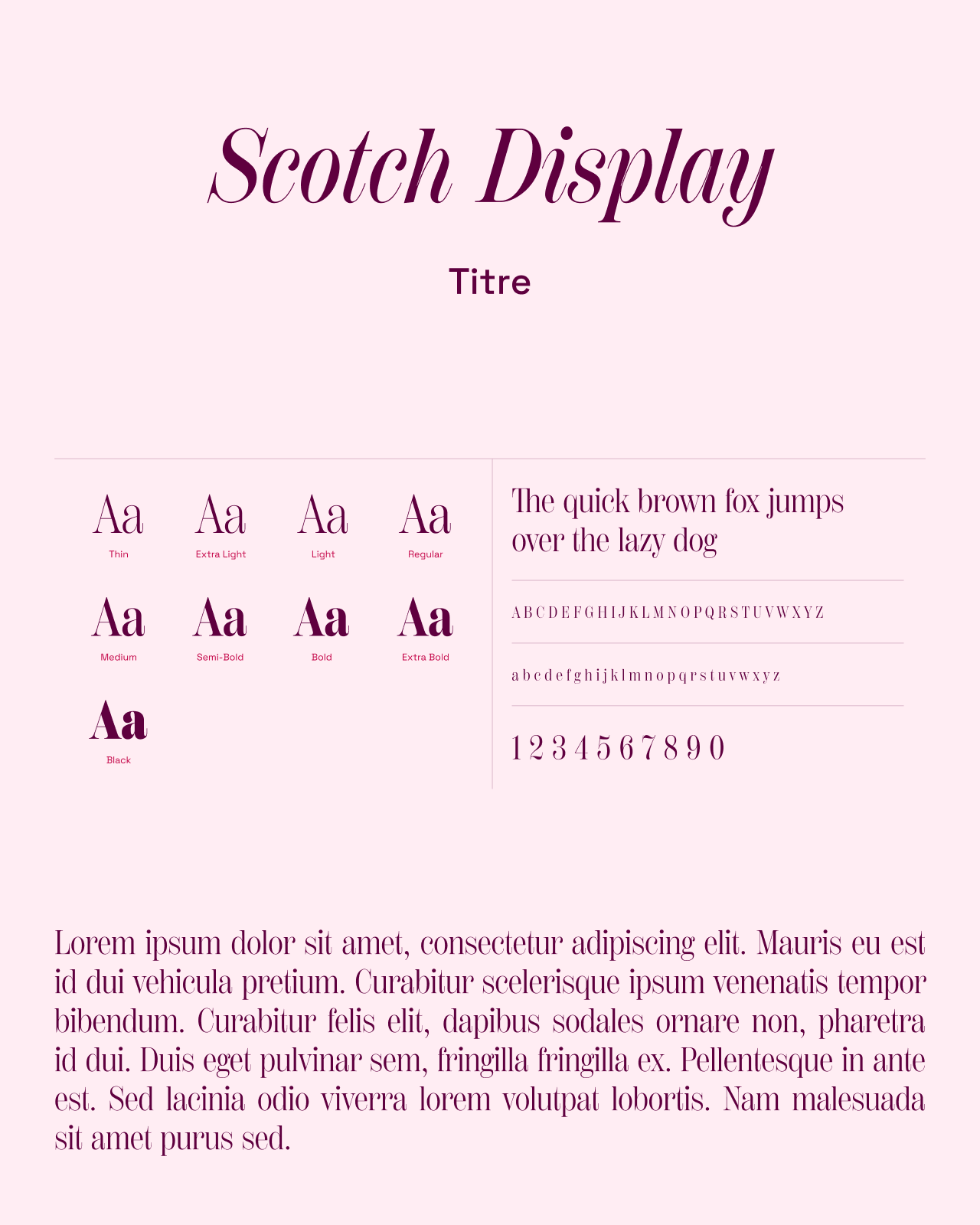
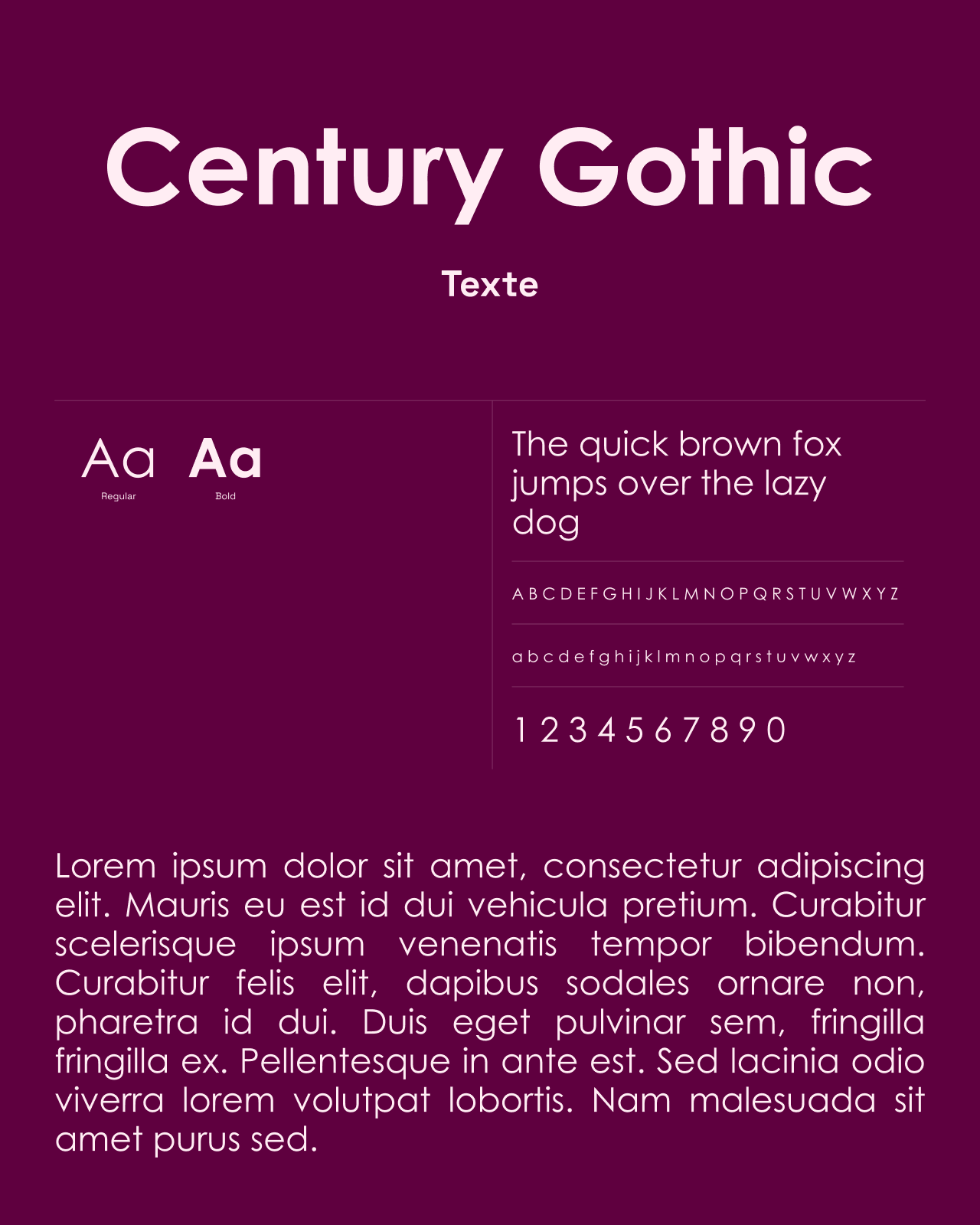
The final logotype pairs bold, rounded letters with a grape symbol. Pale pink, purple and a raspberry accent draw on the colours of wine. Clear-space rules define the breathing room around both logo and symbol. The typography uses contrast: Scotch Display brings serifs and curves to headings, while Century Gothic supports the body text with geometric shapes. Together, they carry the logotype’s character across the brand’s materials.

Primary colour
Secondary colour
Tertiary colour
03 / MOCKUPS
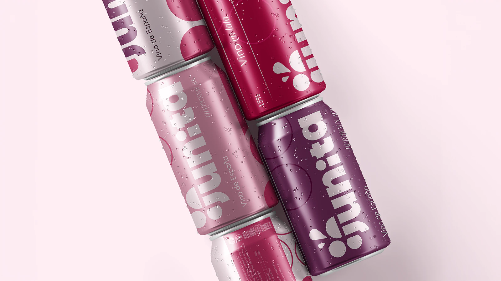
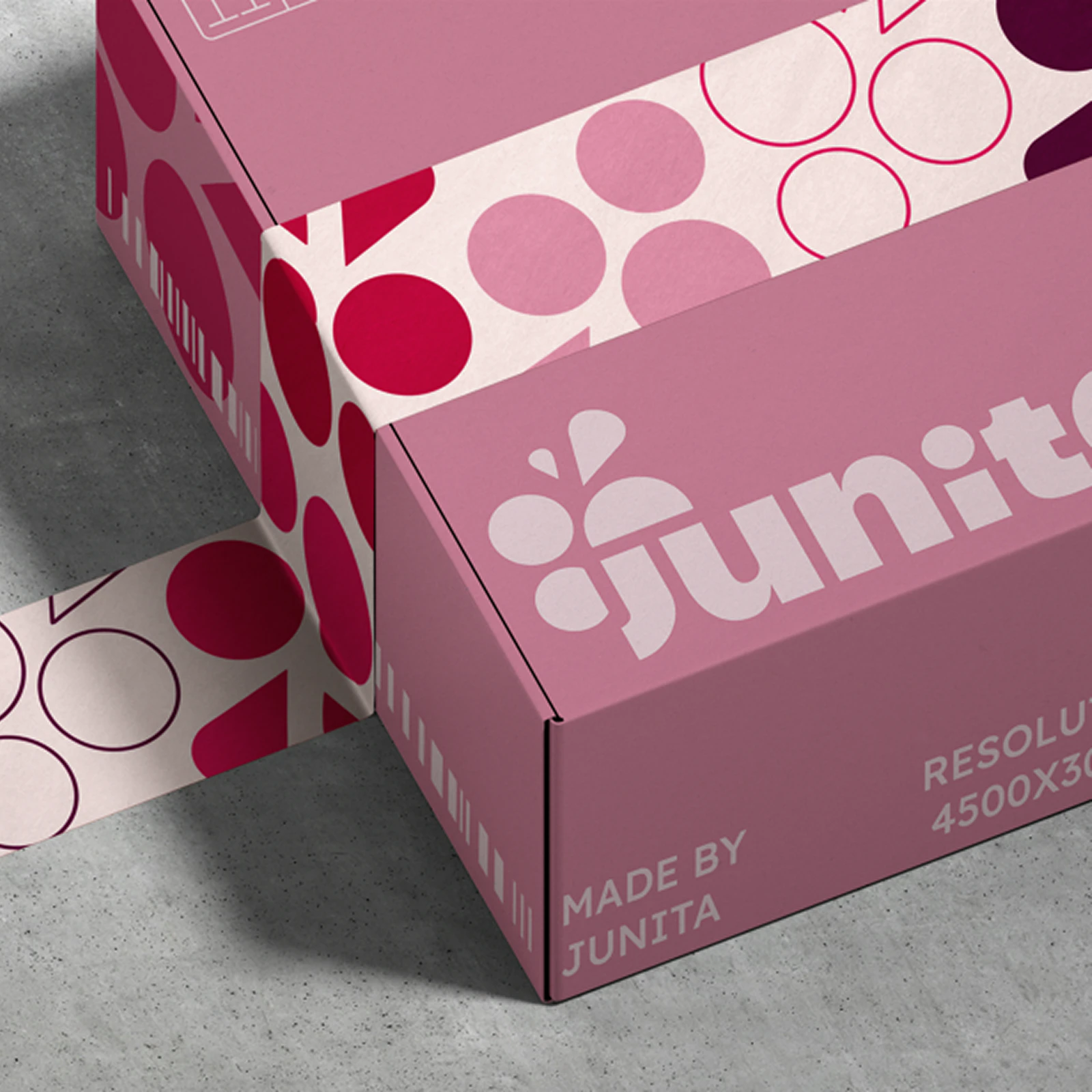
The identity extends to cans and packaging. The logotype takes a prominent position, while the grape shapes become a pattern connecting the different applications. Variations of pink and purple bring consistency to the range. The mockups make the initial idea tangible: another way to discover wine, in a practical format to take along and share at picnics, festivals or evenings with friends.