- HEX
- #FFFFFF
White
- RGB
- 255 / 255 / 255
- CMYK
- 0% / 0% / 0% / 0%
 Start a project
A collection to explore. An aesthetic in motion.

THE PROJECT
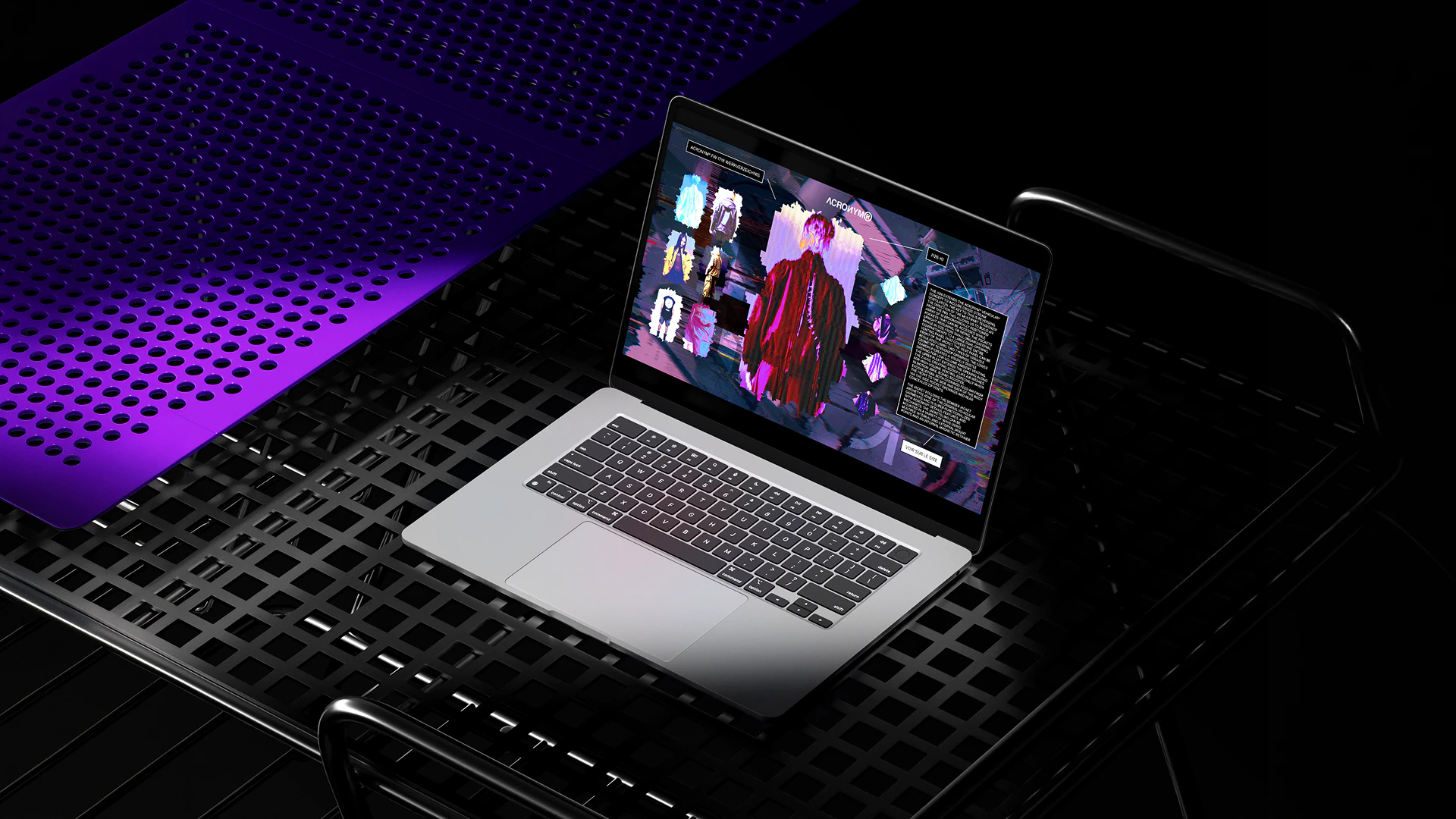
A lookbook introduces a fashion collection through silhouettes, garments and accessories. This UX/UI concept turns that format into an interactive ACRONYM® microsite, combining photography, animation and distortion effects. The challenge was to give the exploration a sense of rhythm while keeping the silhouettes, details and garment descriptions easy to browse.
THE EXPERIENCE
Selecting a piece brings its silhouette to the centre of the interface, alongside detail views and a description. Photography alternates with distortion effects to shape the pace of discovery. A link then leads to the product on the brand’s website.
ART DIRECTION
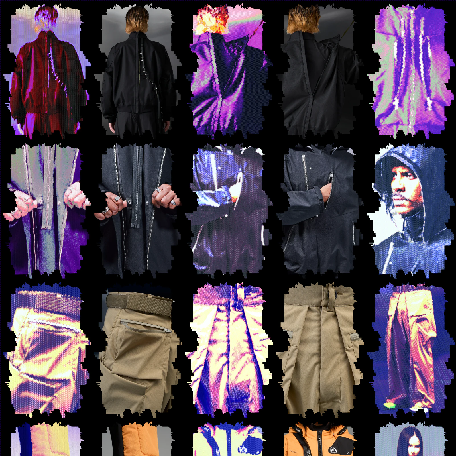
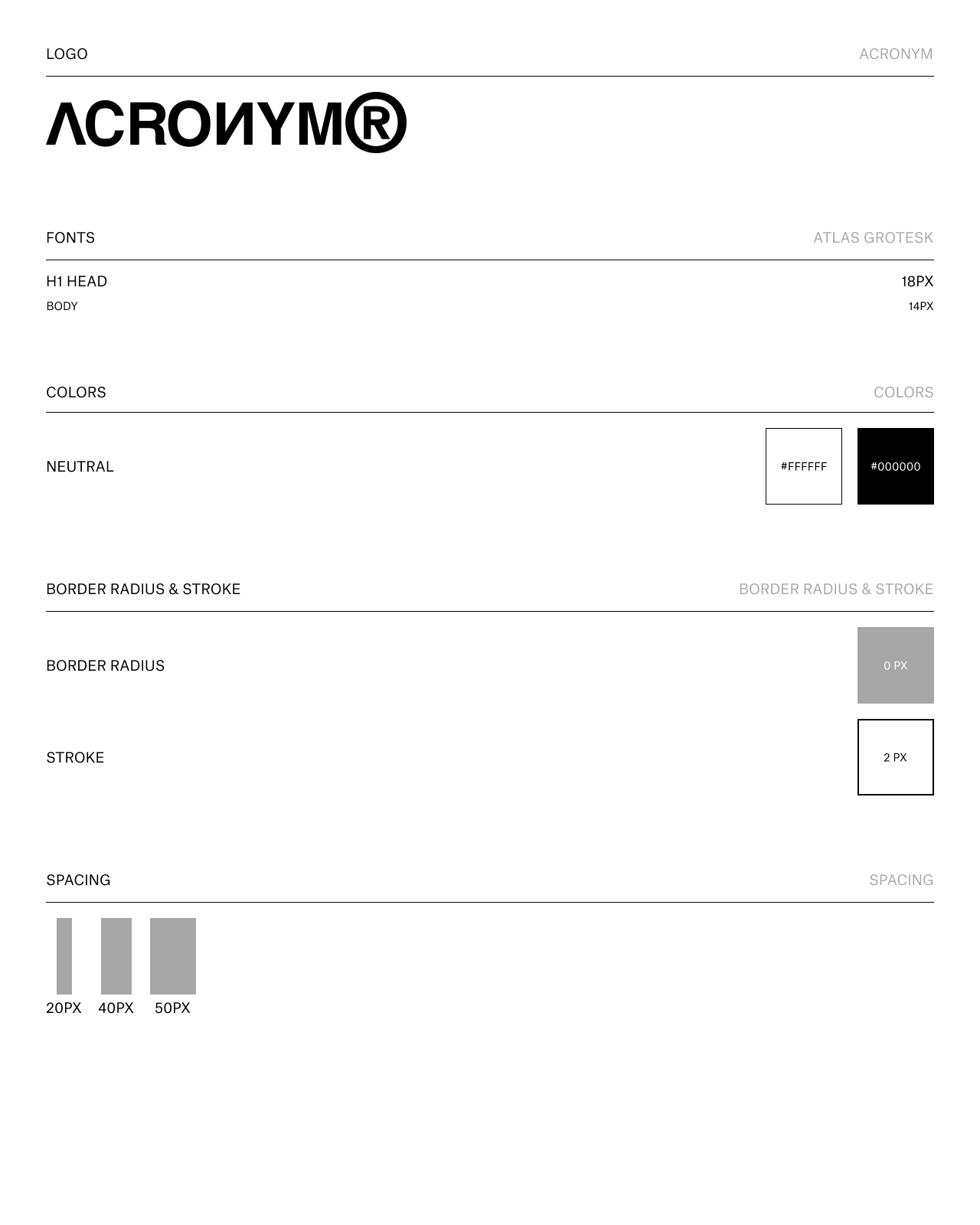
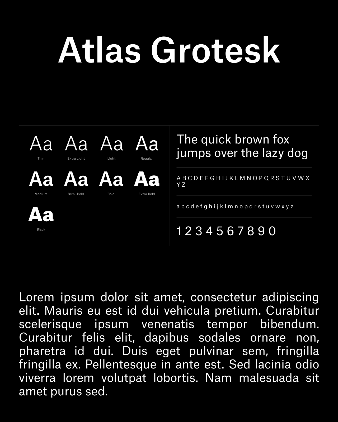
Black, white and Atlas Grotesk structure the text and controls. Saturated colours, irregular crops and glitch effects are concentrated in the imagery. The logo animation introduces this visual language, while the style guide defines the interface’s borders, type sizes and spacing.
White
Black