Annaïs Paris
A clearer offer. A rethought journey.
E-commerce redesign · Figma design
UX/UI Design
Client: Annaïs Paris
Tools used

CONTEXT / ANNAÏS PARIS
A fresh perspective
on the brand.
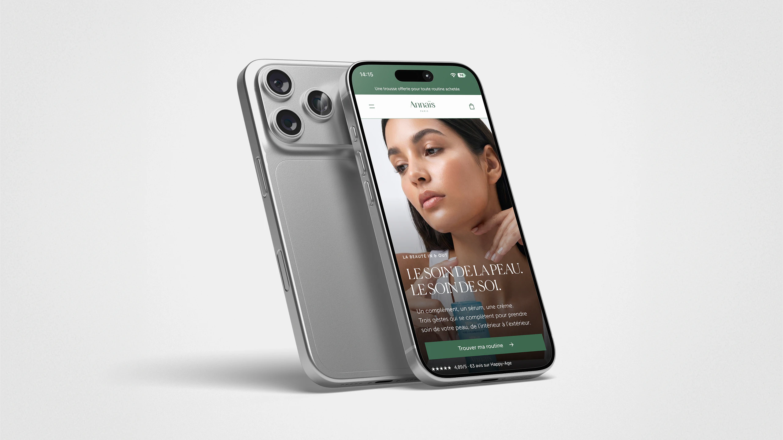
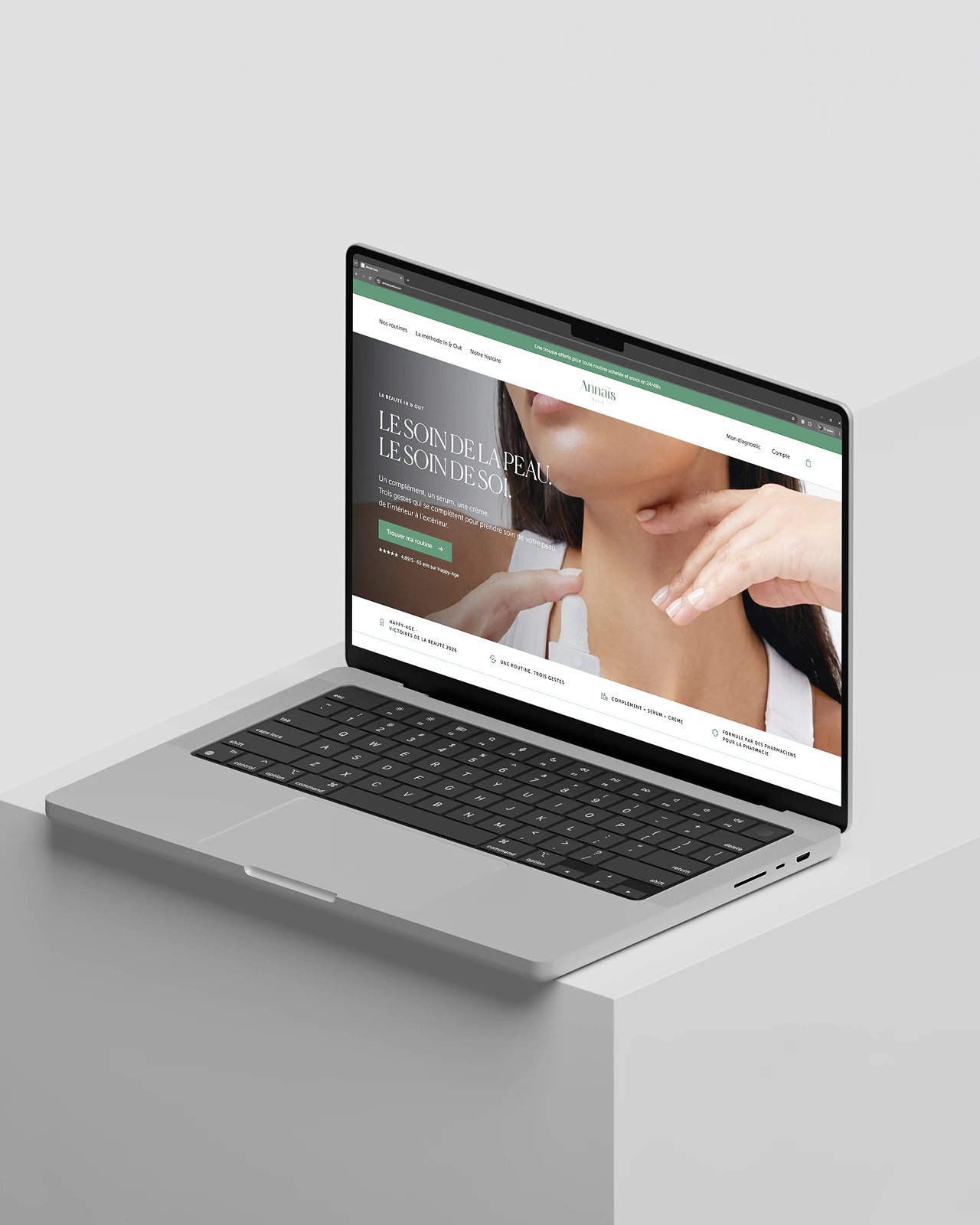
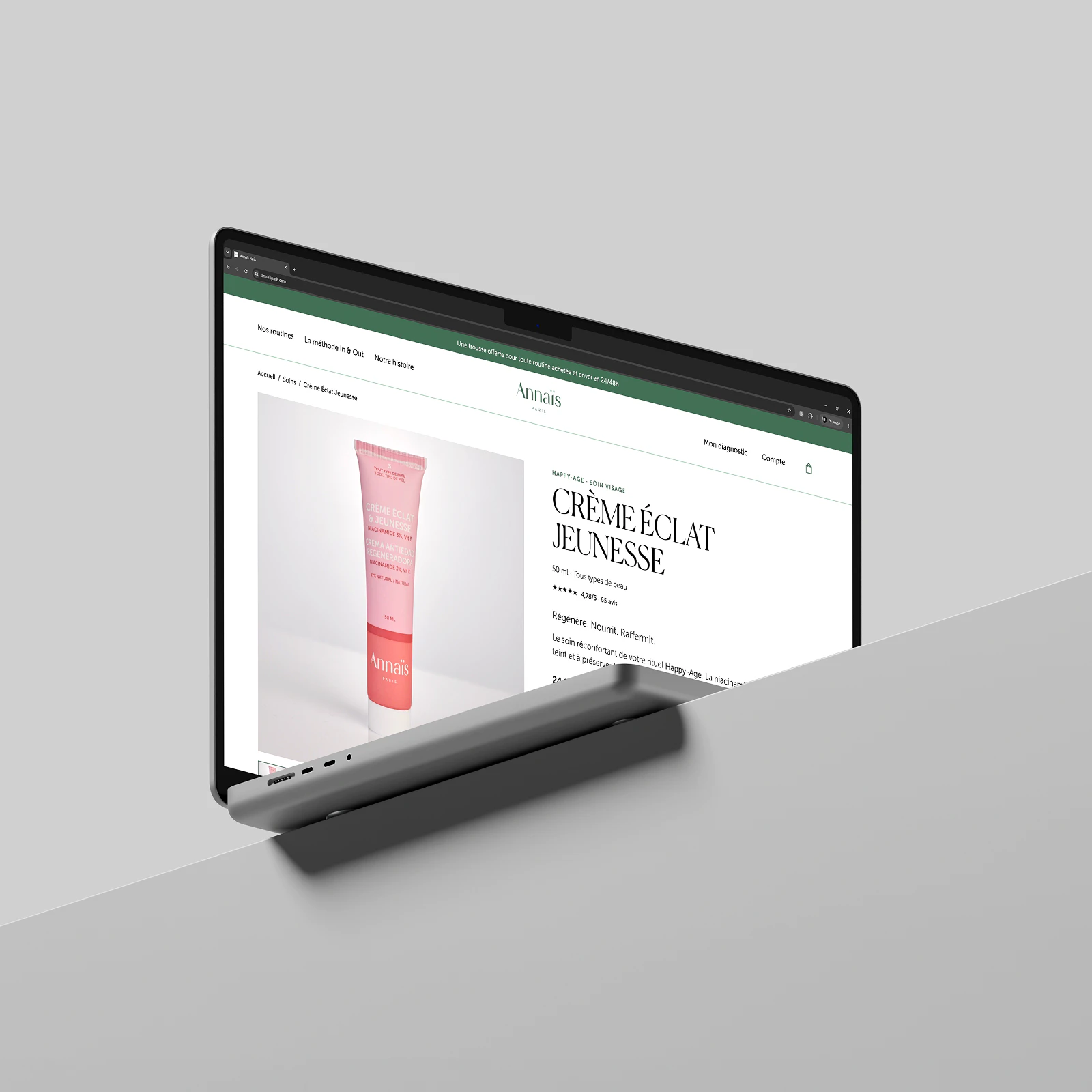
Annaïs Paris needed a website redesign to improve the experience of its existing site. Following an introduction through PHOQ.tv, I designed new homepage and product page layouts in Figma. The aim was to make the content easier to read, help people discover the skincare range and rethink the journey across desktop and mobile.
THE JOURNEY / DISCOVER & CHOOSE
From the first look
to the right skincare.
The homepage introduces the brand, its routines and its skin diagnostic. On the product page, a clear hierarchy connects the product presentation with its benefits and guidance on how to use it. Open compositions, contrasting typography and green accents guide the eye while leaving plenty of room for imagery.
THE EXPERIENCE / MOBILE
The same care,
on mobile.
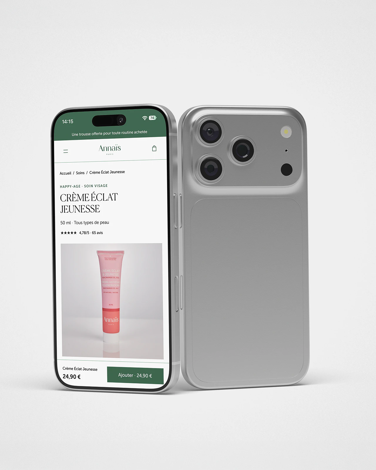
The mobile layouts carry the same hierarchy into a vertical format: simplified navigation, content revealed as you scroll and an add-to-basket action at the bottom of the product page. These designs establish a consistent journey across screen sizes from the Figma design stage.
Next project