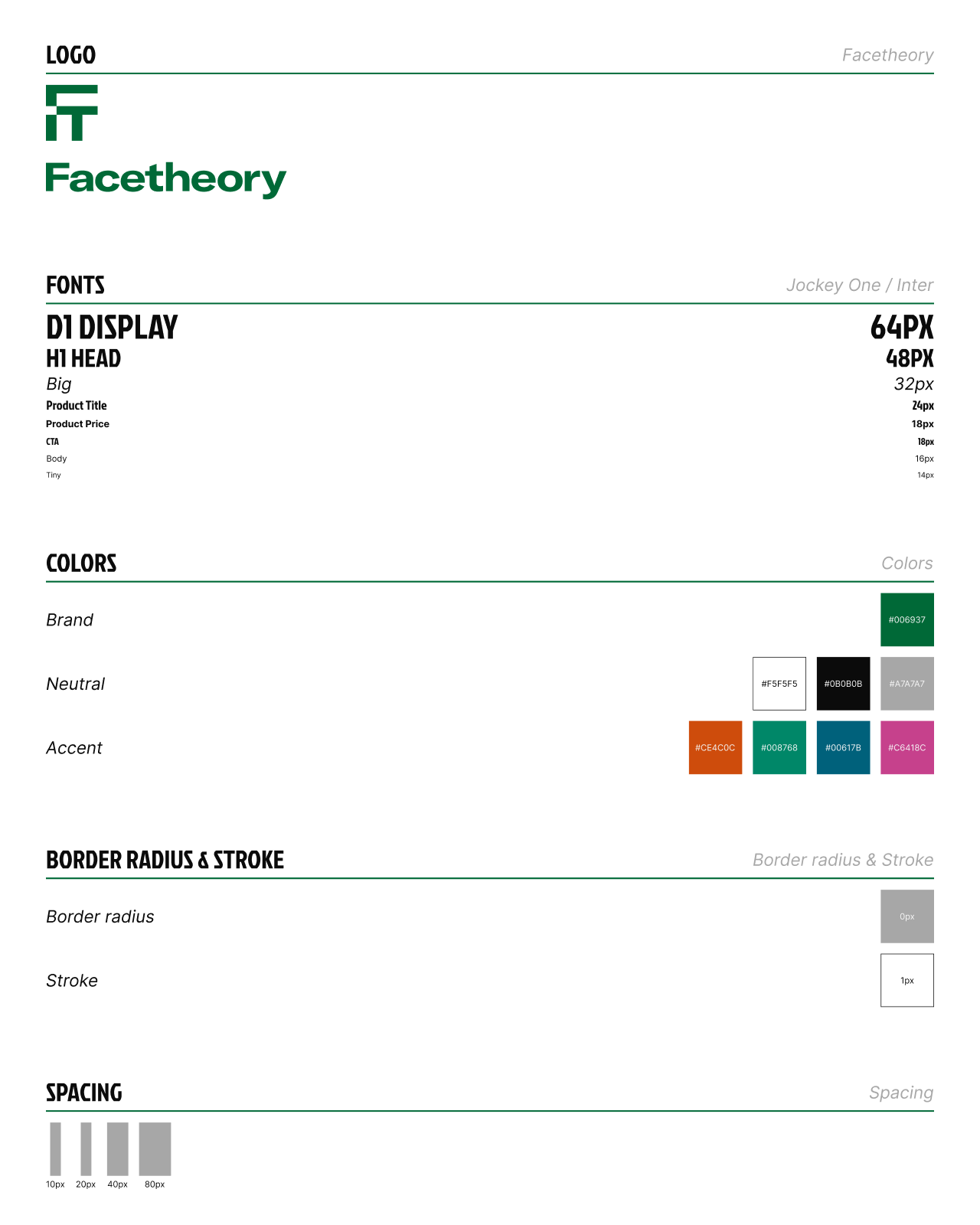
- HEX
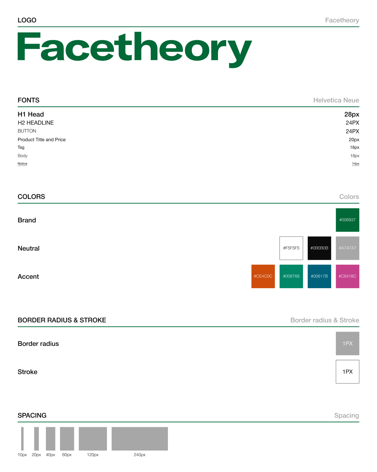
- #006937
Green
- RGB
- 0 / 105 / 55
- CMYK
- 100% / 0% / 48% / 59%
 Start a project
One brand, two expressions. From minimal to maximal.

THE PROJECT
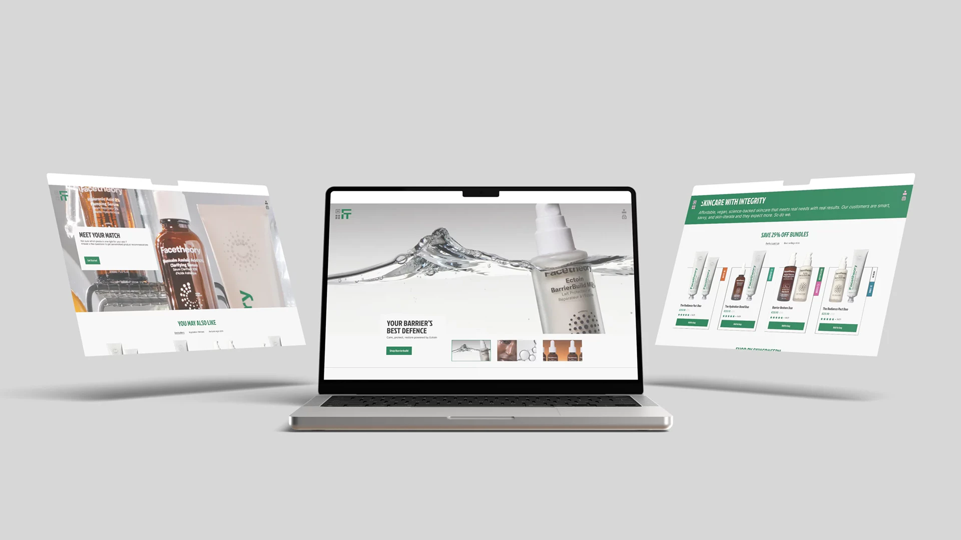
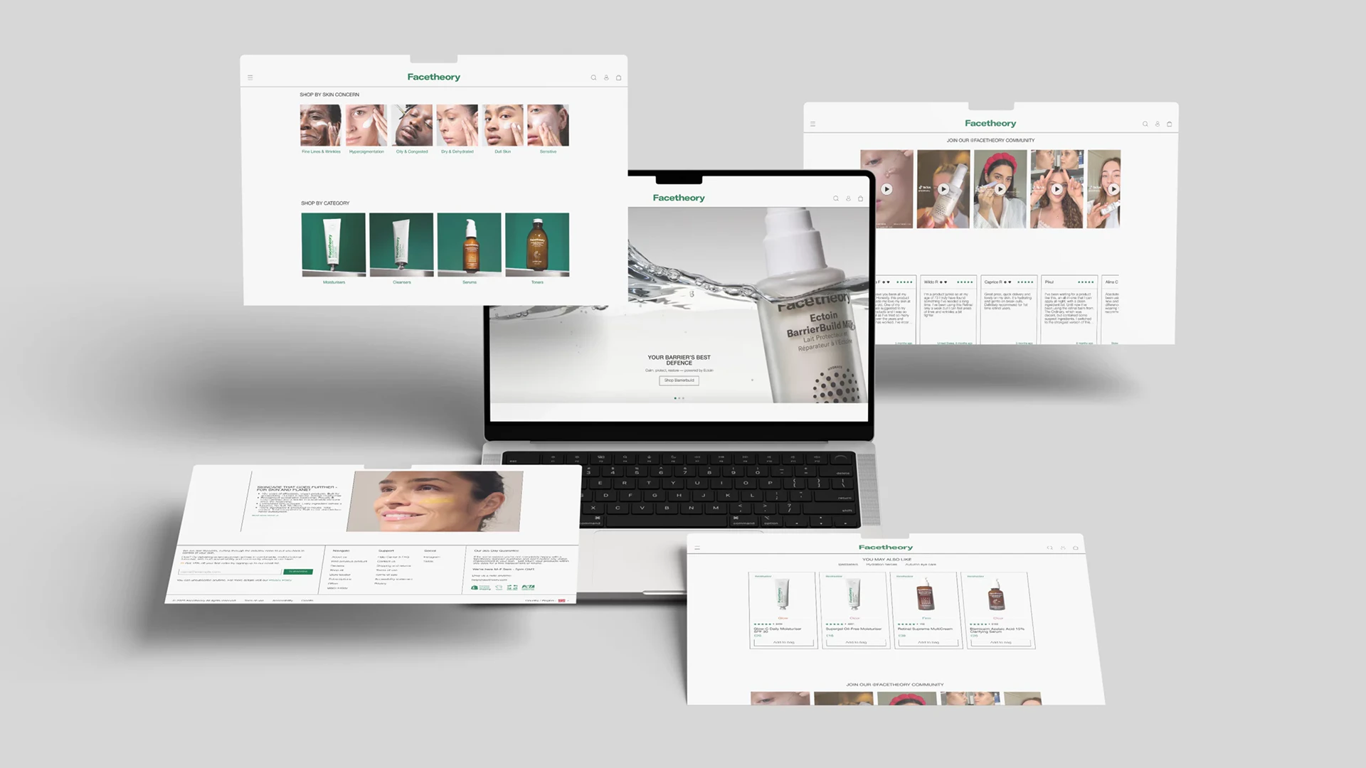
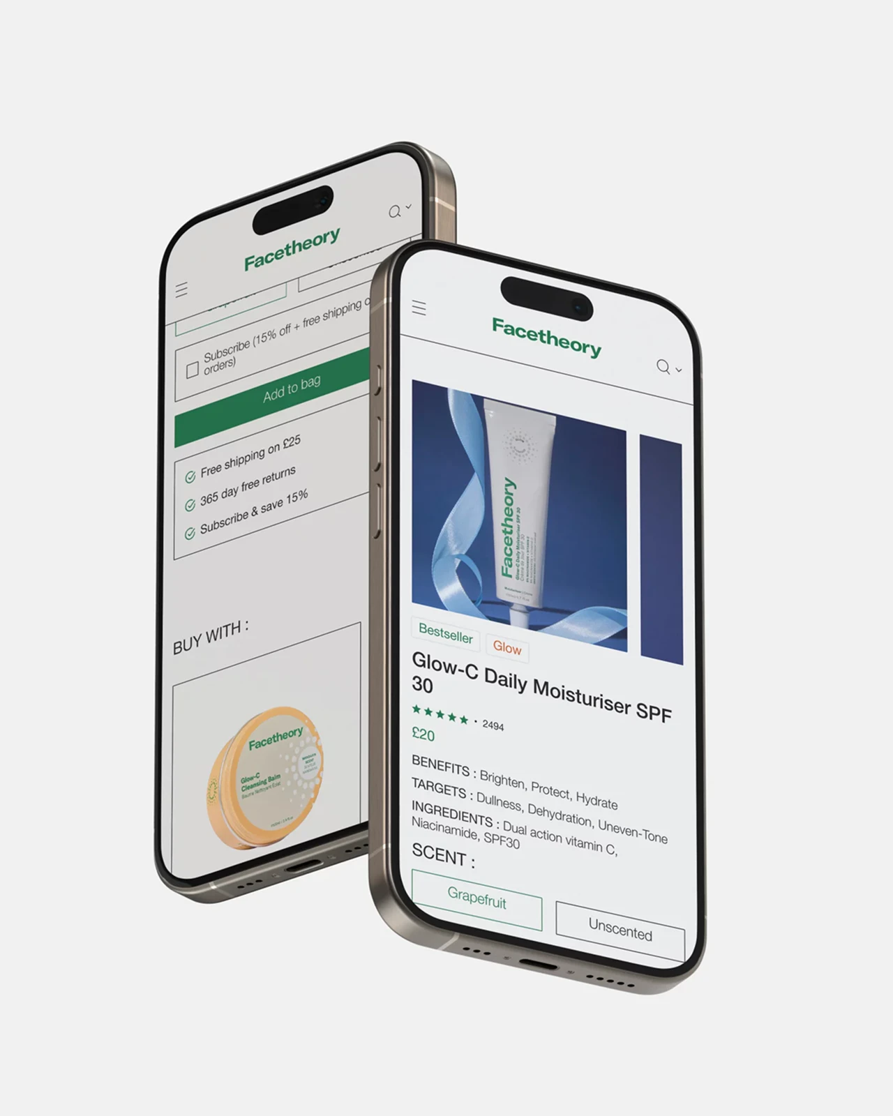
Facetheory is the starting point for this conceptual skincare e-commerce redesign. The challenge was to interpret the same content through two art directions: one minimal, the other maximal. I explored how typography, image placement and composition change product discovery and the shopping journey on desktop and mobile.
Green
Black
White
01 / MINIMAL DESIGN
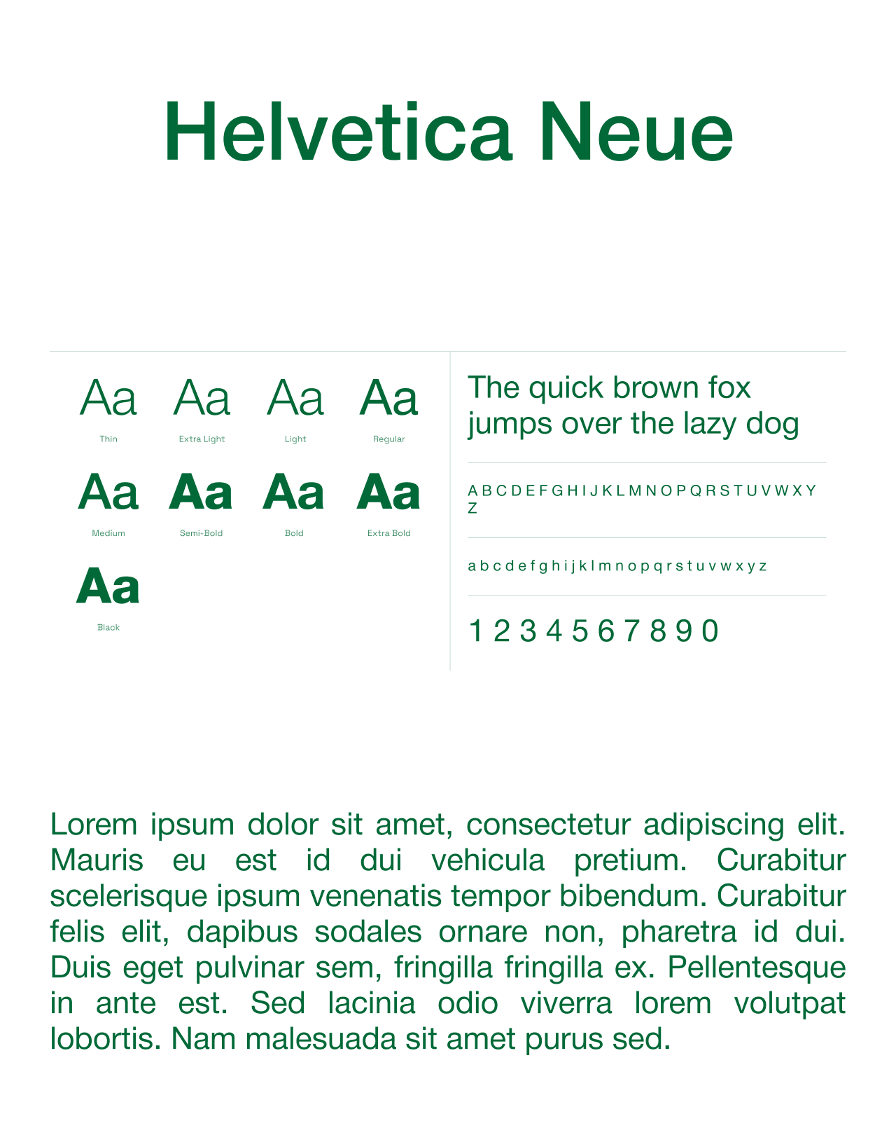
The first direction uses open layouts, fine lines and a quiet hierarchy. Helvetica Neue supports the text, while the brand’s green highlights links, prices and actions. Skincare categories, product information and reviews sit in regular blocks to make reading and shopping straightforward.


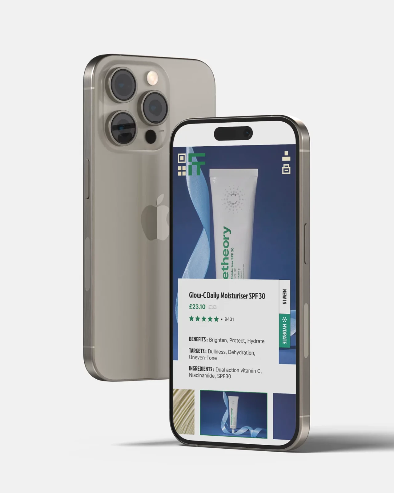
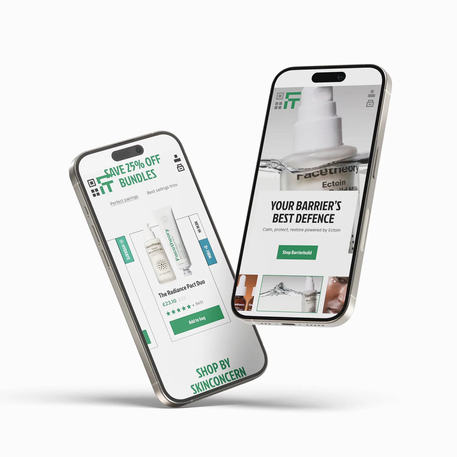
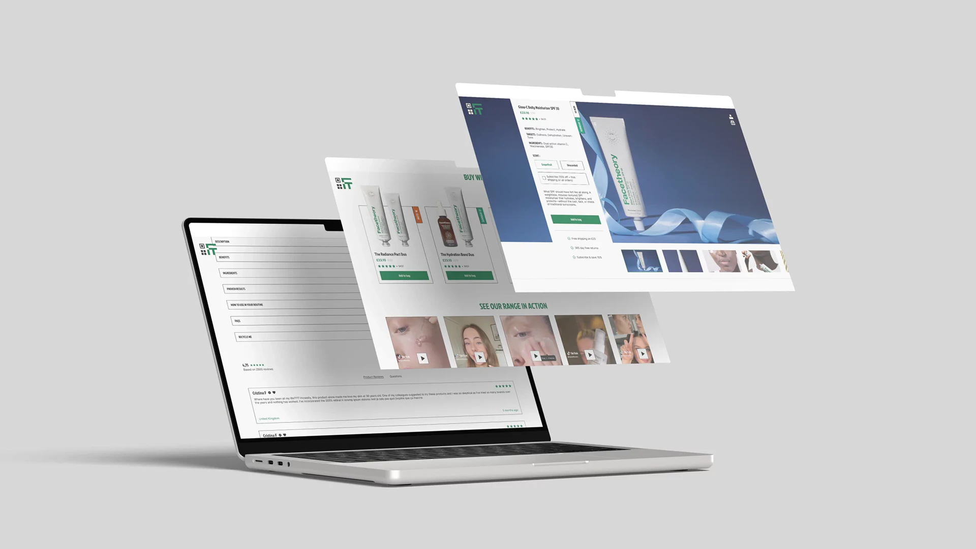
02 / MAXIMAL DESIGN
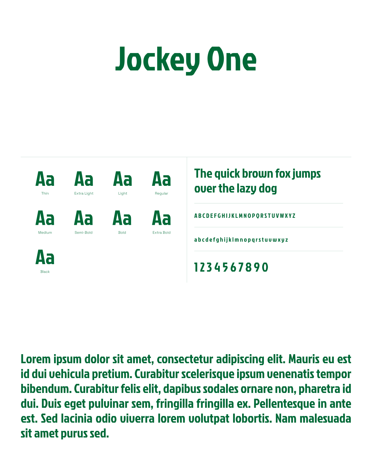
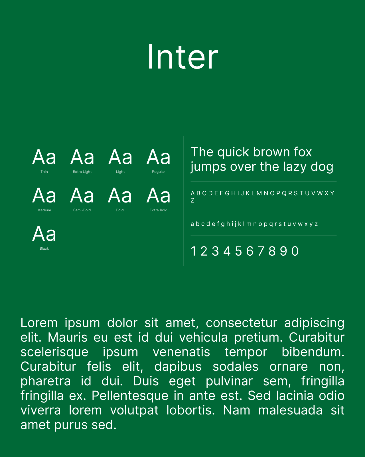
The second direction gives more space to photography and contrasts in scale. Jockey One adds character to headings alongside Inter for body text, while a monogram and geometric icons strengthen the interface’s identity. Information overlaps images and green buttons highlight actions, retaining the cues needed to discover and buy skincare.